
Mobile devices have revolutionized our access to information, shopping, and connectivity. By 2021, they accounted for over half of global website traffic, a trend set to increase. With most users now browsing via mobile devices, offering a mobile-friendly experience is imperative, not optional.
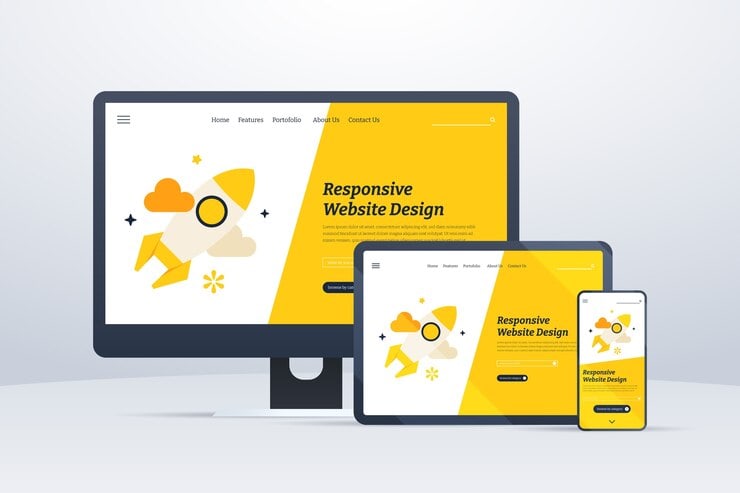
Responsive Web Design
The principle of responsive design aims to deliver an optimal viewing experience, ensuring effortless navigation with minimal resizing, panning, and scrolling across various devices. This approach leverages flexible grids and layouts, CSS media queries, and scalable images to maintain a consistent and robust design on diverse screens.
Benefits of Responsive Web Design
Cost-Effective Maintenance
Utilizing responsive web design eliminates the need to design and manage distinct websites for desktop and mobile platforms. Instead, it enables the creation of a single website that seamlessly adapts to various devices, resulting in significant time and cost savings over time.
Best search engine optimization
Google endorses responsive web design as the most effective method for optimizing websites to enhance search engine performance.
Upgrade user experience
Responsive web design ensures that users can consistently access identical content and features across various devices. This eliminates the need for them to familiarize themselves with a new interface each time they switch devices.
Mobile friendly
Responsive web design as the most effective method for mobile friendly
Saving money and time
Implementing streamlined web development processes using responsive design can have a profound impact on a business’s bottom line. Not only does it result in significant cost savings by eliminating the need for separate designs for desktop and mobile devices, but it also enhances productivity by simplifying website maintenance and updates. With responsive design, businesses can ensure that their websites are optimized for all devices, improving customer satisfaction and loyalty in the process. By focusing on enhancing their website’s content and user experience, businesses can connect with their target audience more effectively and ultimately drive growth and success in the digital marketplace. Additionally, responsive design reduces the risk of errors and inconsistencies, providing a more seamless and user-friendly experience for visitors. As businesses continue to adapt to the ever-changing digital landscape, investing in responsive design is essential for staying ahead of the competition and meeting the needs of today’s tech-savvy consumers.
Challenges and Solution
Performance Optimization:
Achieving an equilibrium between delivering robust content and ensuring swift loading times on mobile devices, while maintaining a superior user experience, necessitates meticulous optimization strategies.
Future-Proofing Responsive Web Design
Responsive web design must adapt to new devices and screen resolutions as technology evolves. To future-proof designs, web developers should stay current with web development trends, emerging standards, frameworks, and tools. Keeping up with browser updates and their features ensures designs function across new devices and browsers.
Responsive design ensures websites can scale and adapt to various devices and sizes. A mobile-first approach and responsive techniques help businesses keep their sites relevant and accessible, maintaining a strong online presence in a competitive market.
Accessibility
Ensuring a responsive website is accessible to users with disabilities is crucial. Web Content Accessibility Guidelines (WCAG) provide standards to make web content more accessible. Adhering to WCAG helps people with disabilities navigate and interact with the site. Proper HTML tags and semantic markup enable screen readers to interpret content accurately. Developers should prioritize keyboard navigation, ensuring interactive elements are accessible via keyboard, essential for users with mobility impairments. Text alternatives for non-text content like images and videos help users with visual impairments understand the context. These alternatives should scale properly for different screen sizes. Additionally, color contrast is vital in responsive web design.
Multiple screen size
Given the diverse array of devices and screen sizes utilized for browsing, maintaining uniform display and usability across all platforms presents a significant challenge.
Conclusion
In today’s mobile-driven world, responsive web design is crucial for businesses to ensure their websites are accessible and user-friendly across all devices. It improves user experience, boosts search engine rankings, and streamlines web development processes, ultimately saving time and money. By implementing responsive design, businesses can adapt to future technological advances and reach a larger audience, making it essential for their digital strategy.
 for Your Website")


